April showers have officially given way to May flowers and we’re looking back on all the shiny new career sites that the Recruit Rooster team hatched last month. Whether it’s a basic re-brand, a fresh new interface, or the addition of new features, we always enjoy seeing the variety among the new sites. The options are truly endless when it comes to branding, leaving the customization in the hand of the customer to ensure a seamless transition from corporate site to career site.
Let’s take a look at the newbies from the month of April!
Hertz
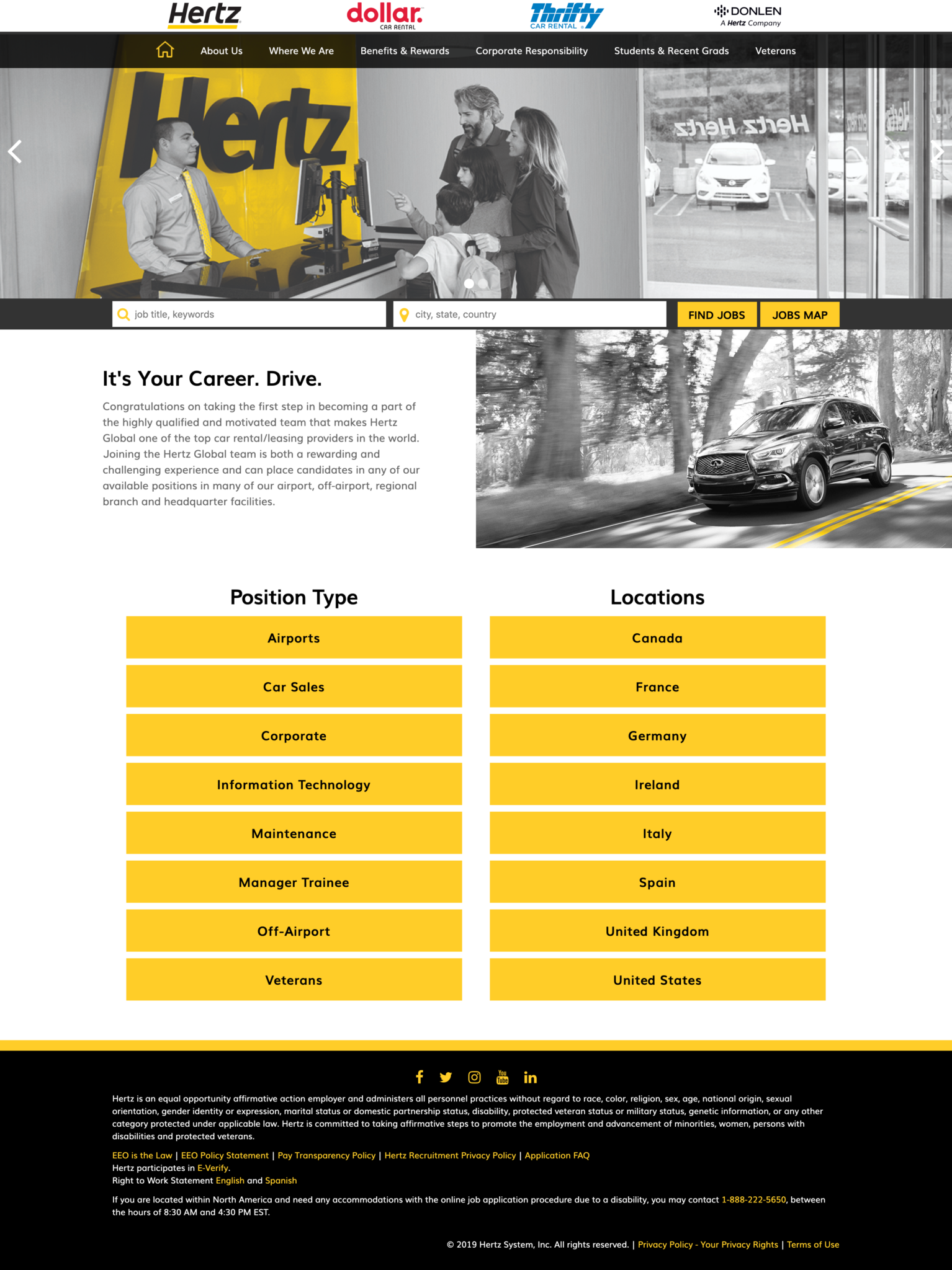
The first thing job seekers will notice is the fun aesthetic of this new site featuring black and white imagery with the only color on the page being the bold yellow that is iconic of the Hertz brand. Taking a look at the static top navigation, information regarding benefits, corporate responsibility, students/recent grads and veterans is displayed, clearly demonstrating Hertz’s corporate values and giving candidates a better idea of what the company stands for. Scrolling below the fold brings a bold, filtered list of job openings, which can be browsed by position type or location. Overall, candidate experience at its finest!
Check out Hertz’s bold new site: https://hertz.jobs/
Pacific Northwest National Laboratory (PNNL)
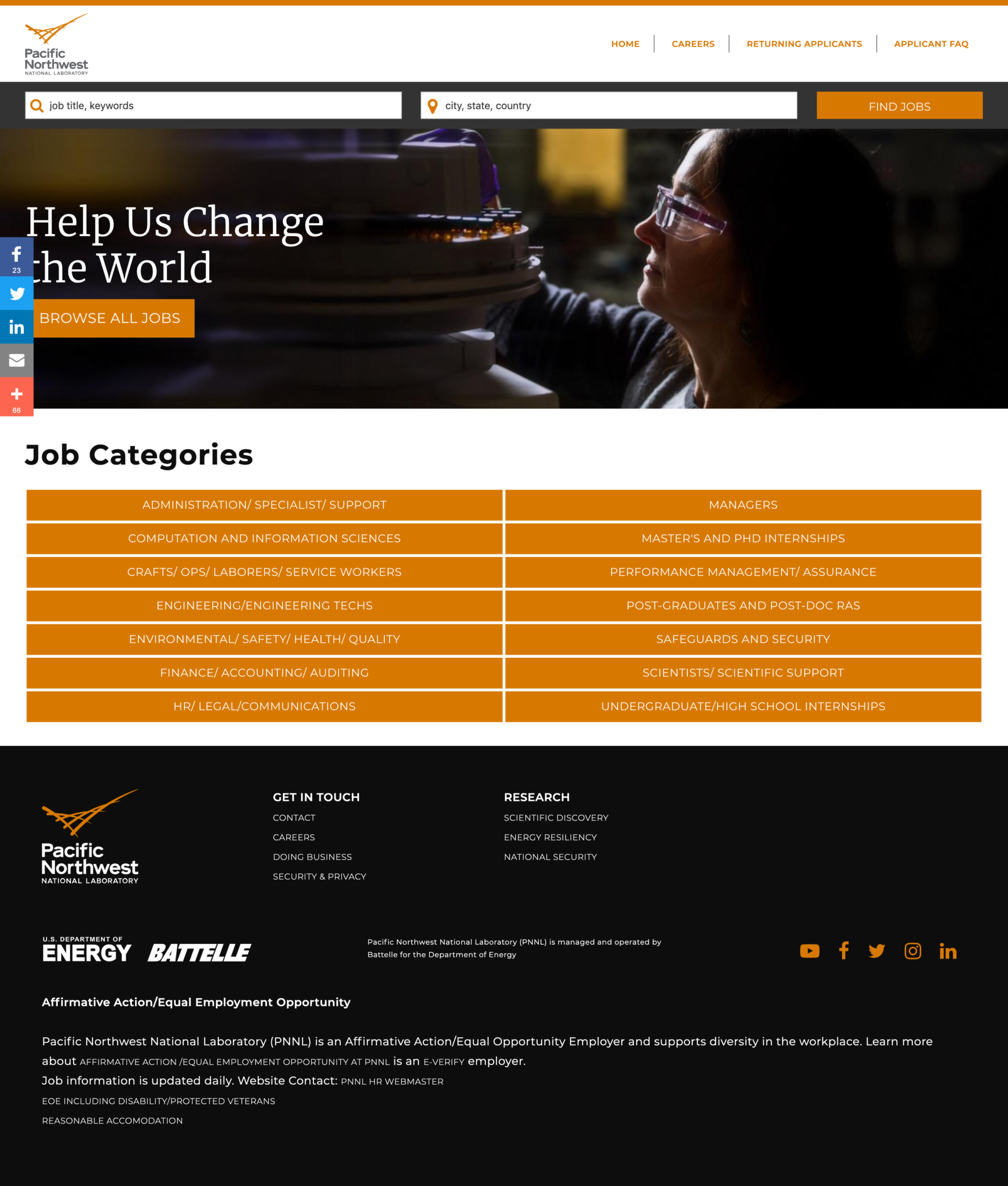
PNNL decided to keep their site simple and focused on the jobs. A simple career site search is placed at the top of the page, just below the navigation bar, followed by a bold image. The site also gives job seekers the option to browse a list of all jobs, or to search by category. The footer of the page includes links to additional resources, and links to the PNNL social media accounts. Looking good, PNNL – congrats on the sharp new site!
Take a peek at the new PNNL career site: https://pnnl.jobs/
IMI Precision Engineering
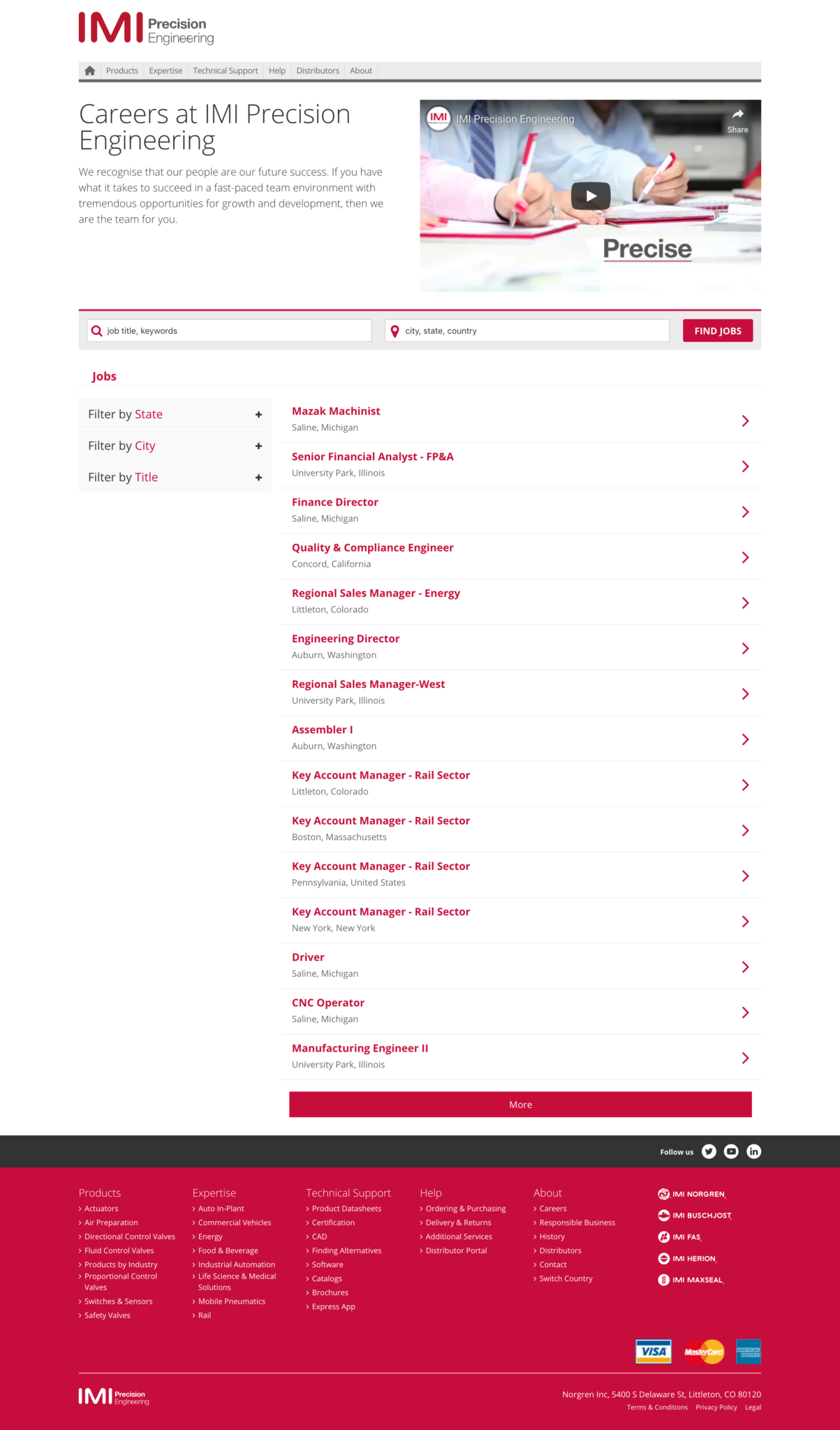
IMI Precision Engineering also features a fun recruitment video, this time placed strategically at the very top of the page. Learning more about the company first, the page then gives way to the job search functionality with several filters for the job seeker’s convenience, including state, city, and title. The top navigation and footer content nicely mirror that of the corporate site, creating seamless integration for the candidate. We love it, IMI, and we hope you do, too!
Take a look at the IMI Precision Engineering site: https://imi-precision.jobs/
Topgolf
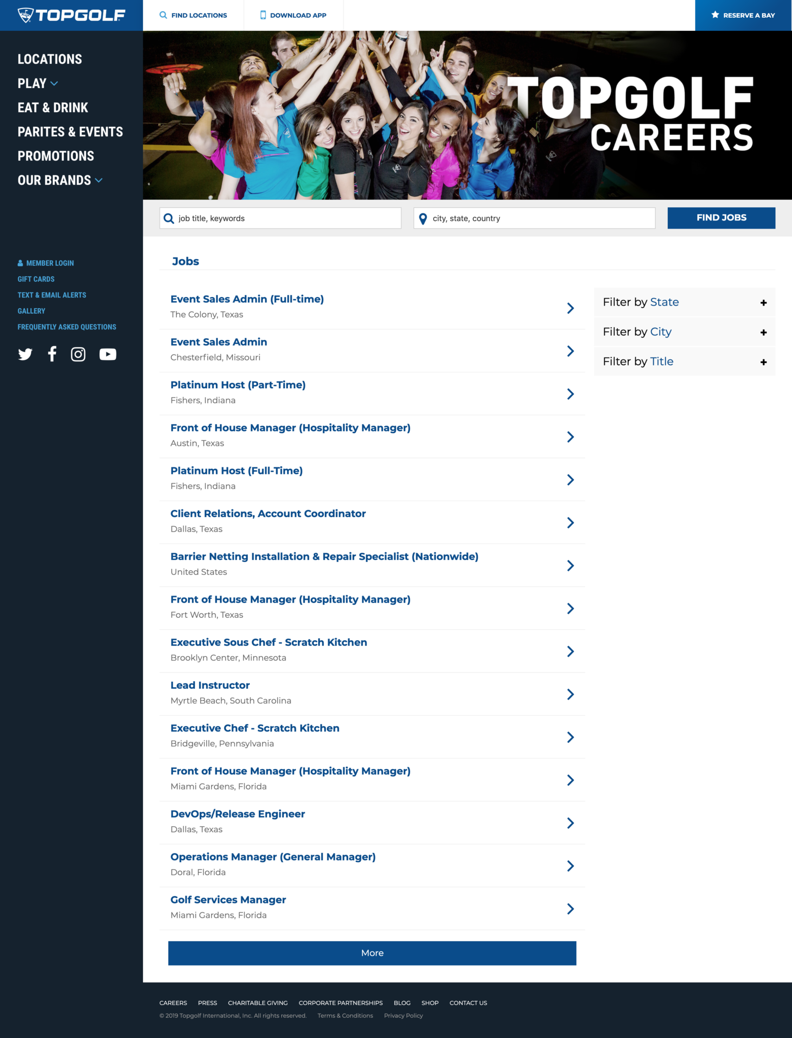
Thinking about Topgolf instantly conjures feelings of fun and excitement, and their career site should be no different! The Roosters brought the fun through exciting imagery of Topgolf employees, and rather than putting much of the information in the top navigation, they switched things up and put it on the left-hand side. The focus here is clearly on the jobs (after all, isn’t that why the job seeker is here in the first place?), with the job search feature beginning above the fold. Social media links are clearly displayed on the left, and the footer features links to charitable giving, a blog, and more. It’s safe to say that this new site is “top” notch!
See the Topgolf site live in action: https://topgolf.jobs/
Another job well done by our Roosters! Love what you’re seeing and want to know how they can help you bring your career site to life through branding, imagery and video? Check out the new Recruit Rooster portfolio page and fill out the form to request information on a free site assessment. You can also visit with the team next week at DirectEmployers 2019 Annual Meeting & Conference! See you back here next month…we can’t wait to see what the Roosters cook up in May!
