What does your career site say about you? Does it illustrate your unique value proposition or define, either written or visually, why a job seeker should want to join your team? When it comes to design and layout, think of your career site as your online storefront where you can “merchandise” your unique aspects and weave together your brand elements, photos, and more to create an engaging space that draws in potential candidates – the possibilities are endless. However, with so much you could do, you may feel confused about revising your current site or starting fresh. That’s where Recruit Rooster comes in – plotting, planning, designing, executing, and doing a little happy chicken dance when your site finally launches and the analytics roll in. Let’s dive in to see the latest project to roll out of the barnyard….
Complex Challenges
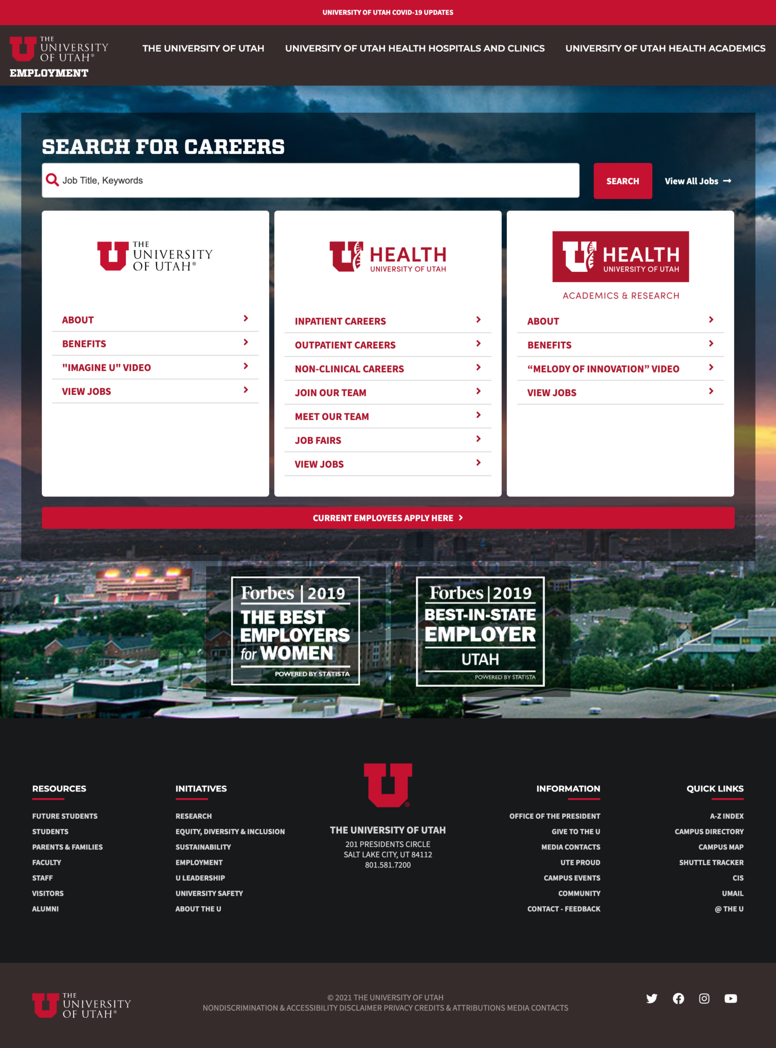
Career site rebranding was the name of the recruitment marketing game for Recruit Rooster client The University of Utah, and its ultimate goal was to align the branding and visual esthetic of their main site and carry that same concept over onto their career site. Doing this presented quite a few unique challenges, beginning with merging three different brands, two applicant tracking systems, and additional complex scenarios that would stem from both their nursing and faculty jobs being in the same search. However, where there’s a will, there’s a way, and these Roosters specialize in sorting out complexities.
Simple Solutions
When it comes to The University of Utah’s career site, these Roosters didn’t just strut across the road; they went over the river and through the woods – simply put, they went above and beyond to help this employer achieve their goal, and then some! After a flock huddle, they let the feathers fly, designing elements that would mirror the look and visual appeal of the main site while simultaneously merging jobs from the organization’s two ATSs into a unified search/filter. To achieve this, they had to unite two different naming conventions for filters and job categories to make them blend seamlessly together. The result? Well, check out their career site and see if you notice two systems.
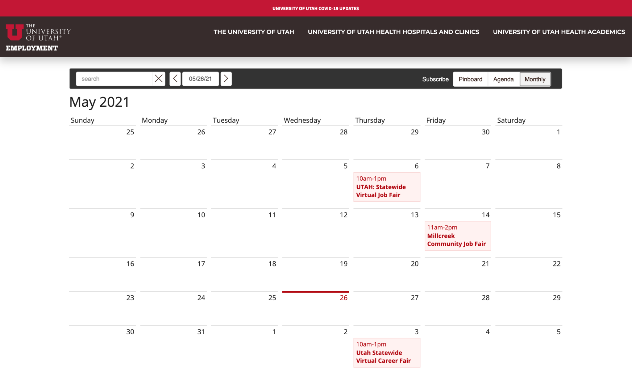
In addition, the team developed custom buttons on the healthcare jobs tailored to the brand, and even took time to curate different pages underneath the healthcare site to illustrate The University of Utah Health’s various hiring initiatives. As a finishing touch, the university opted to implement Recruit Rooster’s event calendar to call additional attention to their virtual and in-person career fairs.
Robust Results
Branded brilliance and clever thinking helped the Roosters knock this site out of the park, and The University of Utah now has not only one location for job seekers to enter, but also multiple paths to view information. As the site continues to grow, plans are already in the works to up the ante even more by implementing Google Talent. This cloud-based search functionality transforms a job search experience by returning high-quality results to job seekers far beyond the limitations of typical keyword-based methods.
This career site marks another feather in the Rooster’s collection of fantastic career sites! Have a career site you’d like to run an accessibility audit on? Or perhaps you’re interested in rebranding or even a complete overhaul with brand new creative solutions like recruitment marketing videos and custom imagery from your headquarters – this crew is the one for Y-O-U. Discover the capabilities of Recruit Rooster and how they can assist you by setting up a time to chat about your goals and upcoming needs.


